2023
Leading Adludio’s APAC expansion across creative, revenue campaigns, and operations, while overseeing global brand and operational strategy

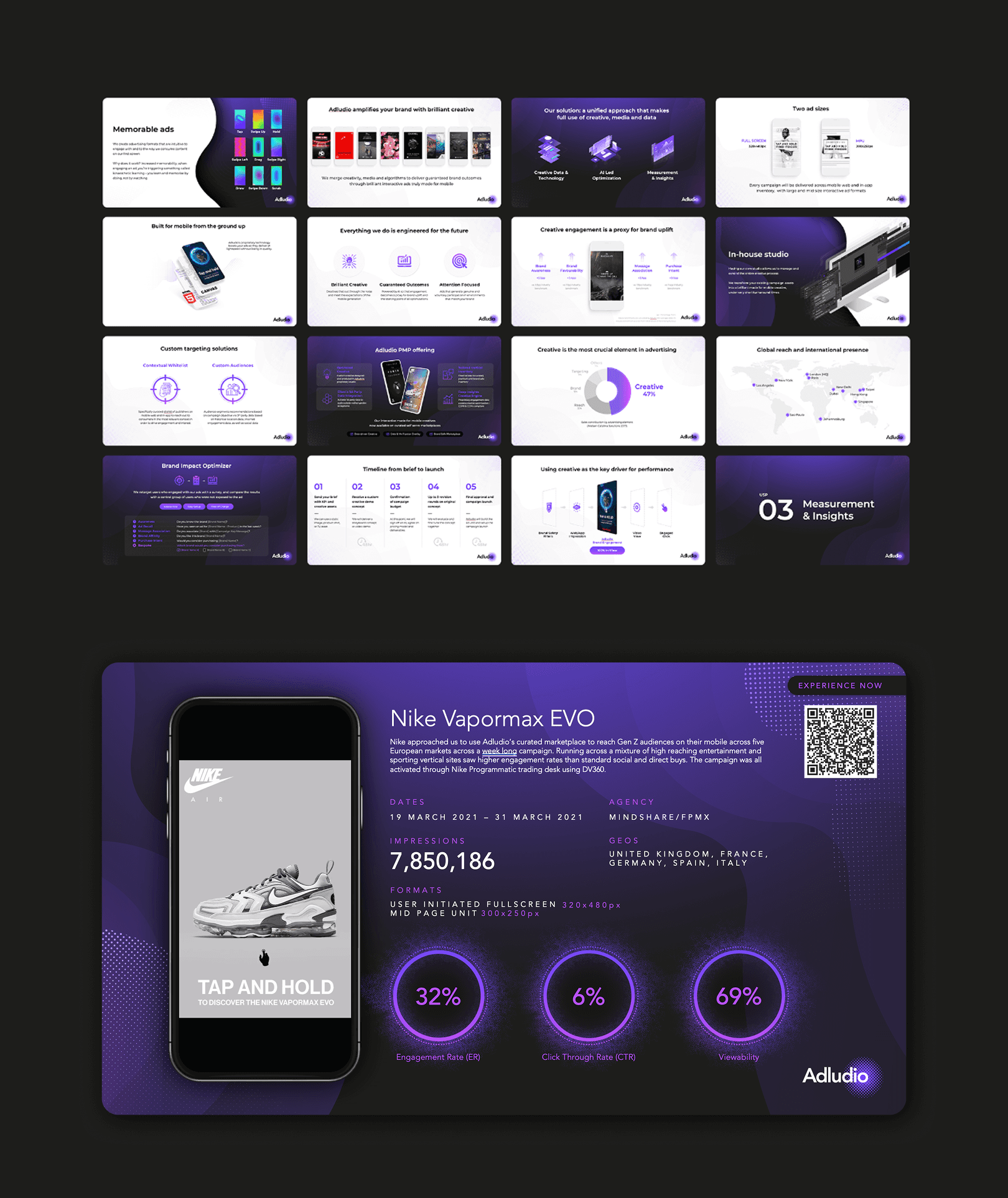
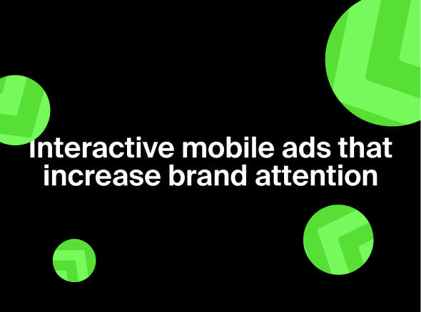
Adludio is a global ad-tech company focused on delivering rich media and interactive advertising experiences.
Working with leading brands particularly in the luxury space, the company combines creative storytelling with technology to produce high-impact campaigns designed to engage their target audience.
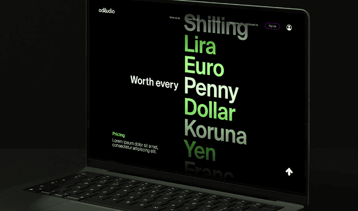
Adludio’s model is built around CPE (Cost Per Engagement) rather than traditional CTR metrics, shifting the focus from passive clicks to active interaction. The goal isn’t just to be seen, but to be engaged with.
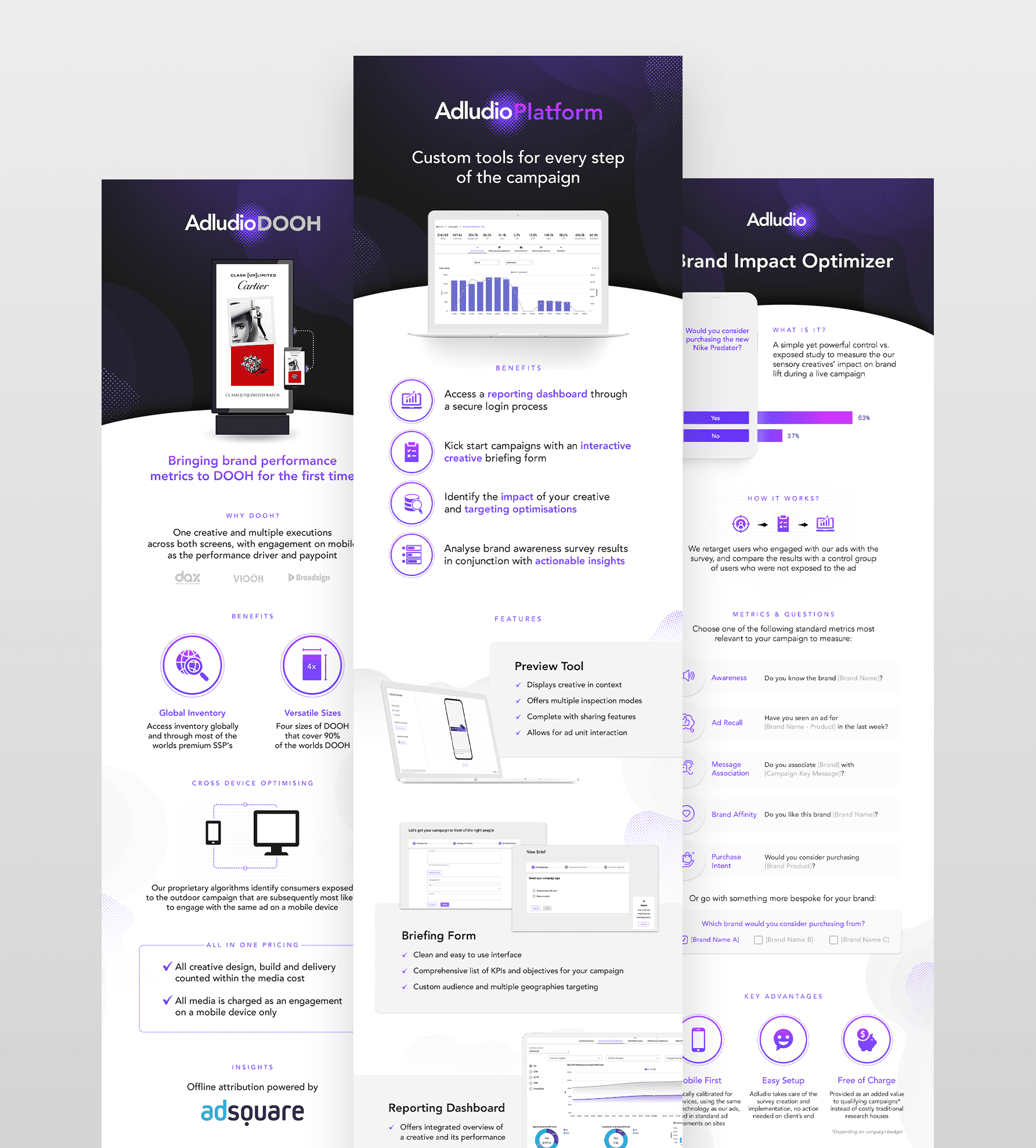
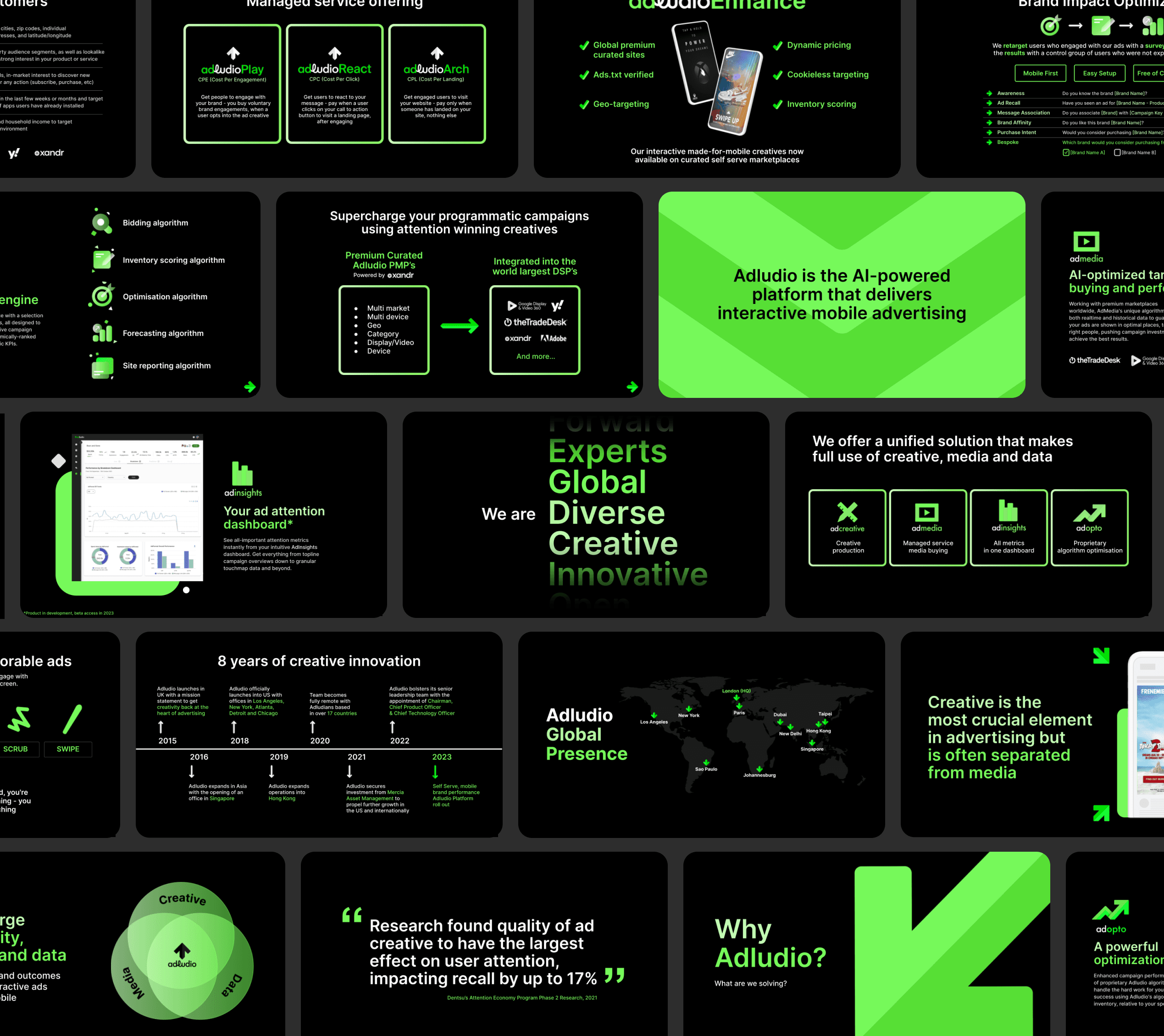
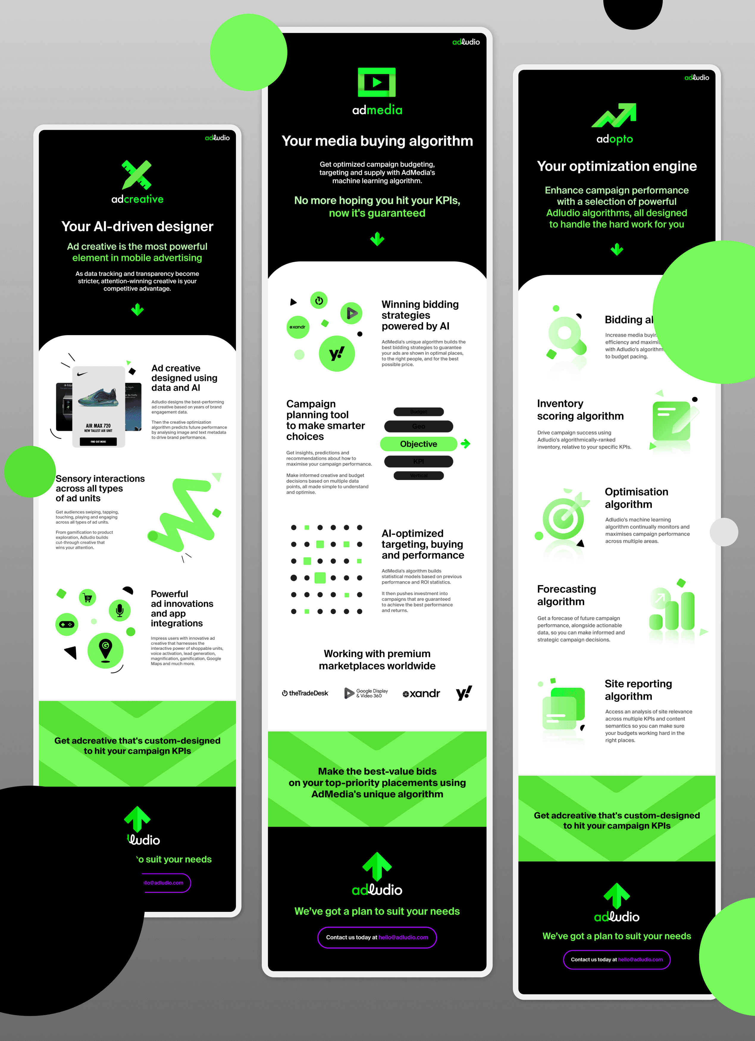
To support this, the company developed its own in-house proprietary platform, designed to build and deploy rich media ads quickly and at scale. It allowed for faster turnaround, more flexibility in execution, and consistently high-performing formats tailored to each campaign.
.
But as the business expanded into APAC, the main issue was that there was no in-house creative or marketing function in the region, and with teams primarily based in other time zones, campaigns couldn’t be delivered or iterated as effectively.
Adludio was trying to grow in APAC without the creative, speed, or local presence needed to make it work.
.
Turnarounds were slower, communication was fragmented, and the work lacked the local context needed to truly resonate. At the same time, the brand itself had little presence in Asia which created a challenge not just in execution, but in establishing credibility in a new market.
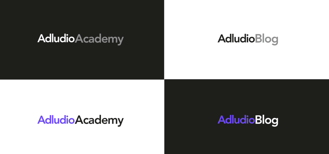
Building on a basic foundation to create a scalable brand
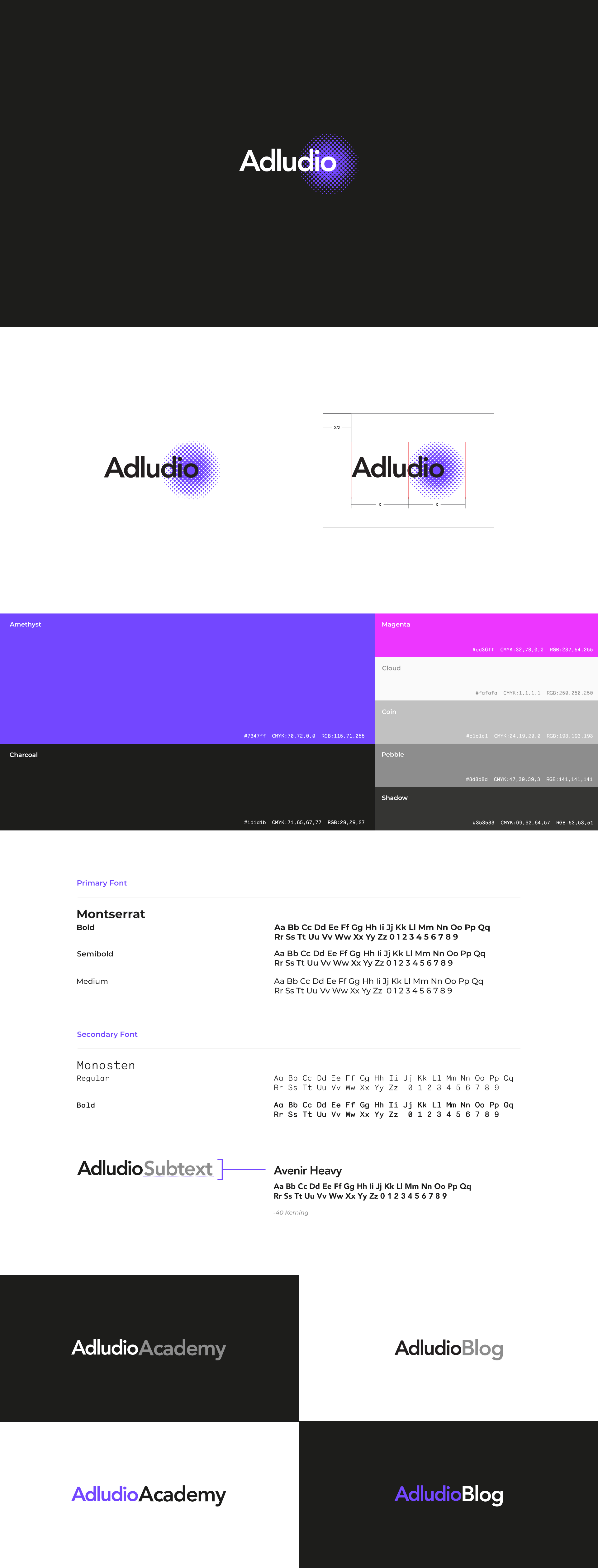
The brand came with the essentials but little beyond that. It lacked a clear system, consistency, and the flexibility needed to support a growing business.
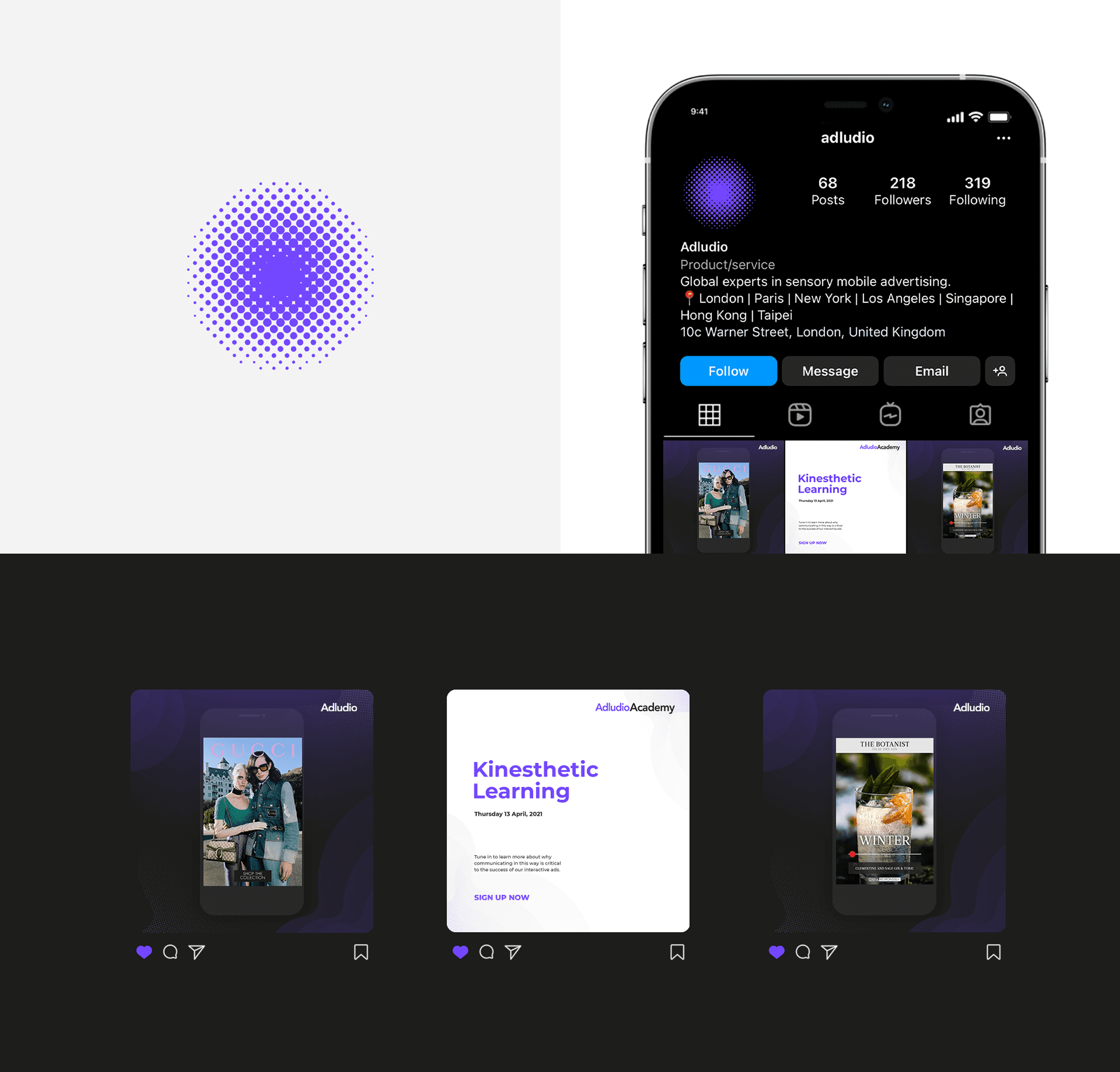
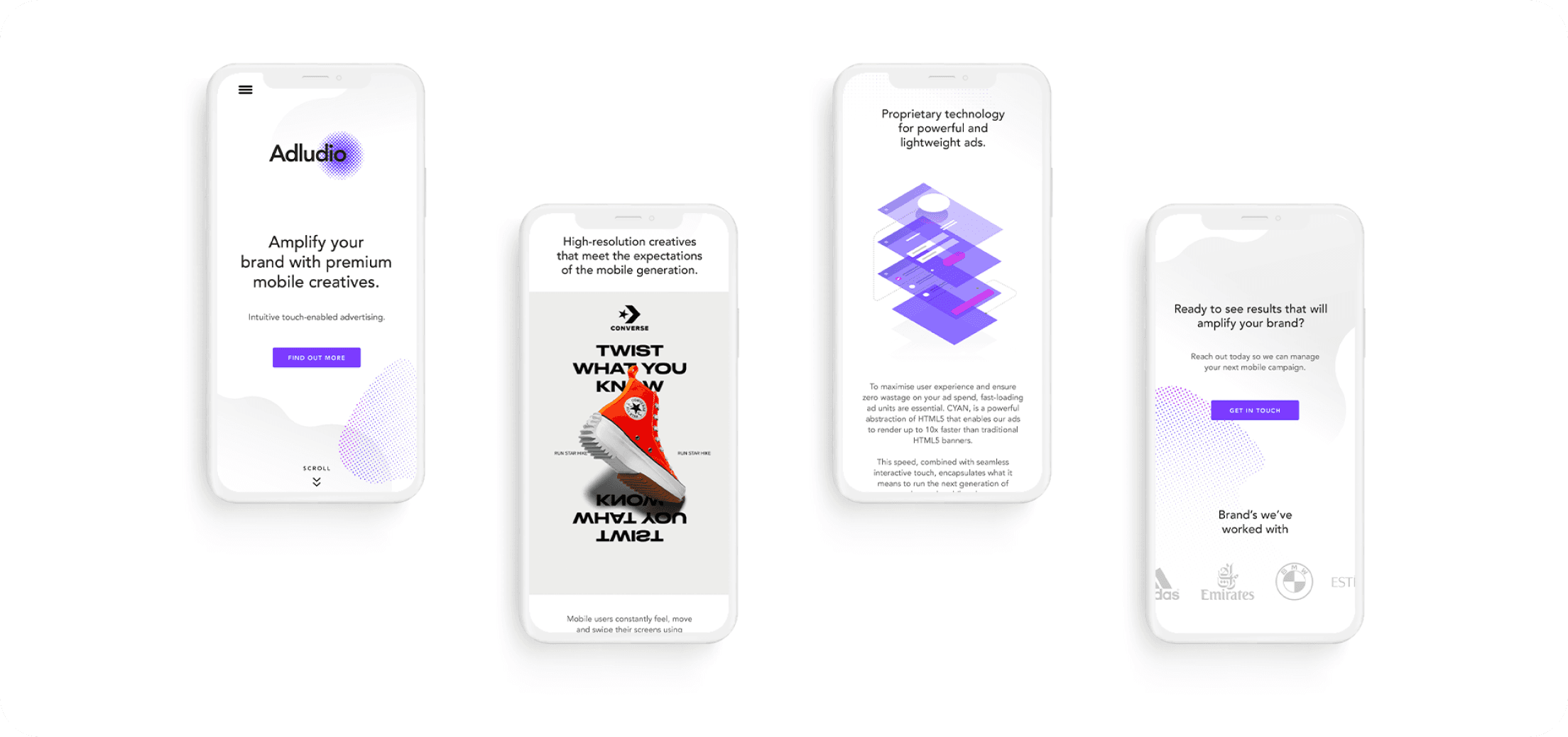
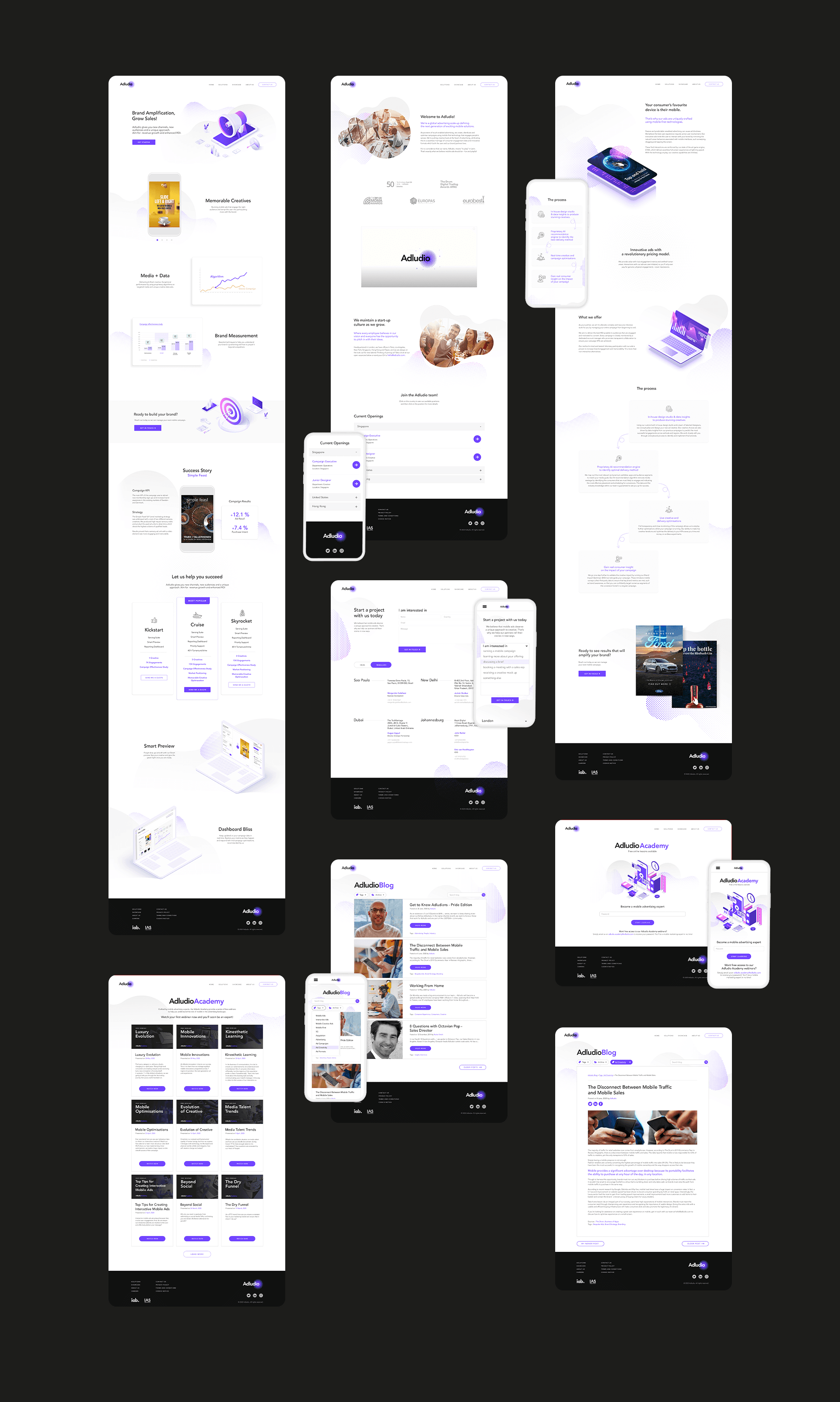
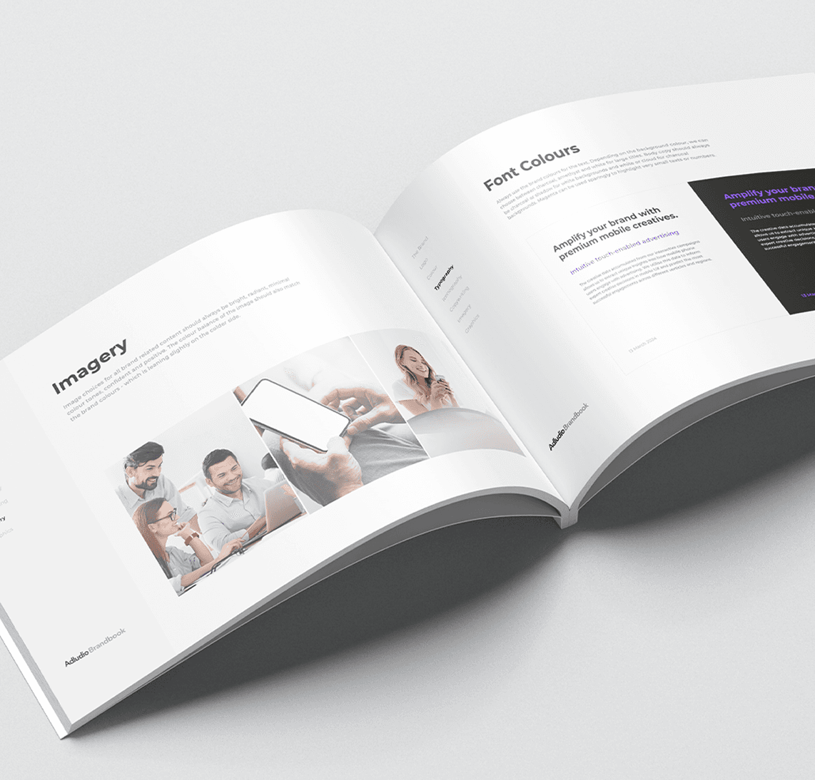
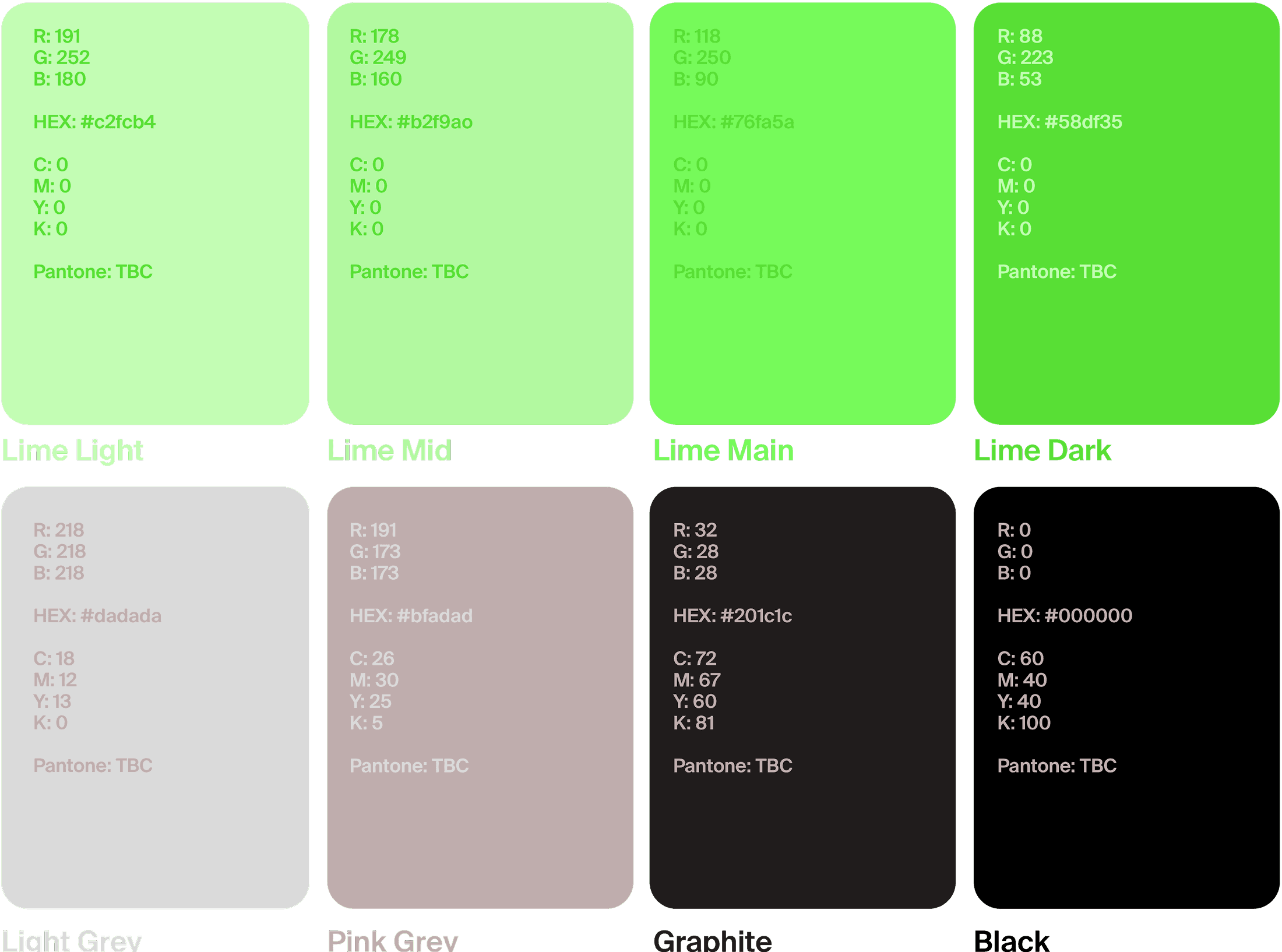
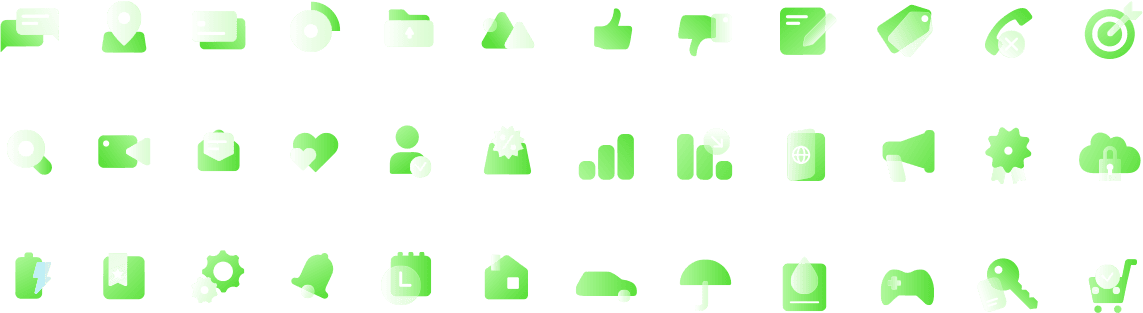
From there, the focus was on expanding what existed into something more structured and usable. Building out a visual language, defining how the brand shows up across different touchpoints, and creating a foundation that could scale across campaigns, regions, and teams.
.
Time and resources were limited. Most of the team’s capacity was focused on BAU campaign work, so the brand couldn’t be developed in isolation. It had to be built alongside the day-to-day.
That meant being intentional with what we created. Instead of over-designing, we focused on a minimal but functional system, just enough to establish consistency, ensure recognisability, and work across multiple platforms. The goal wasn’t to build everything at once, but to create a foundation that could scale as the brand grew.


.
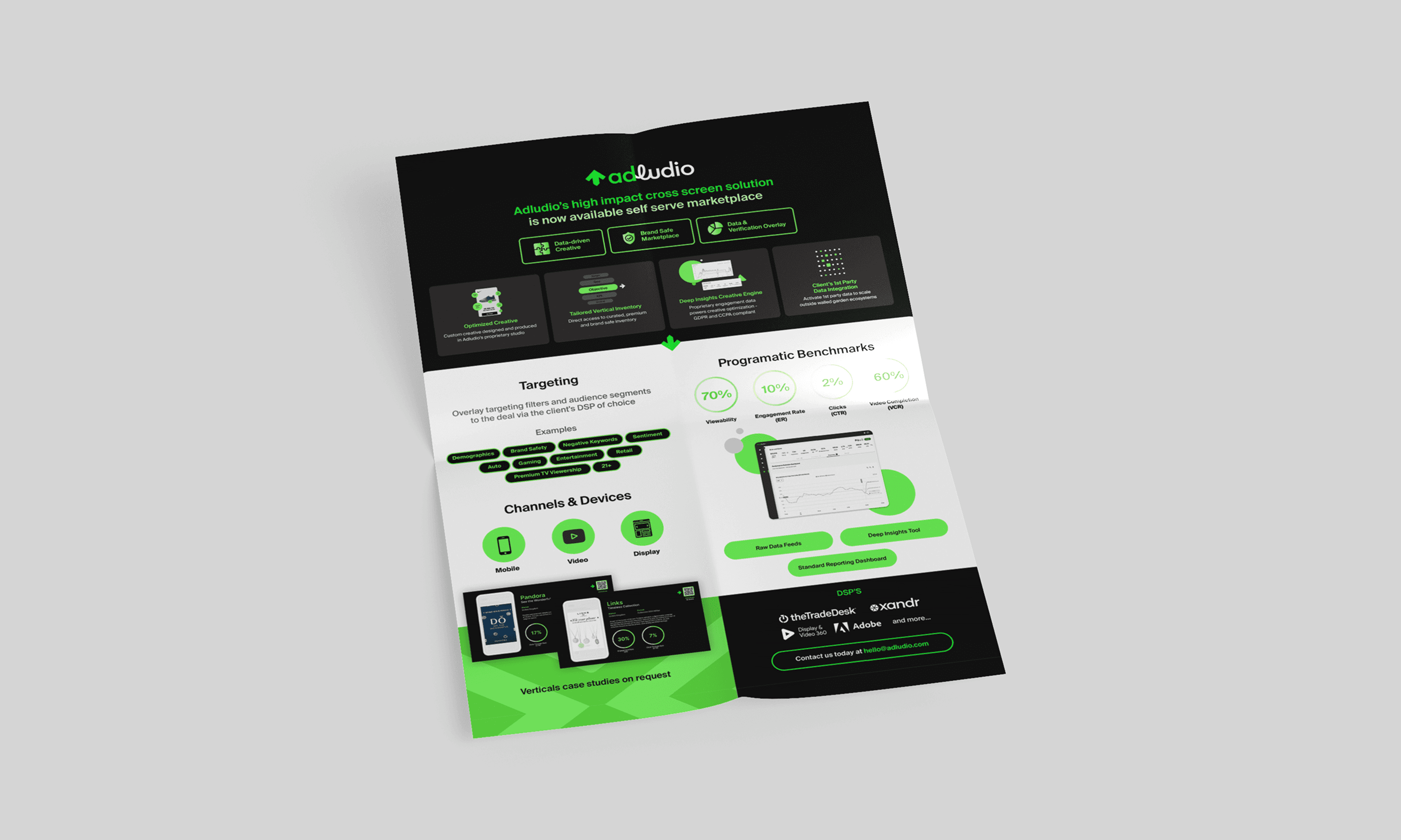
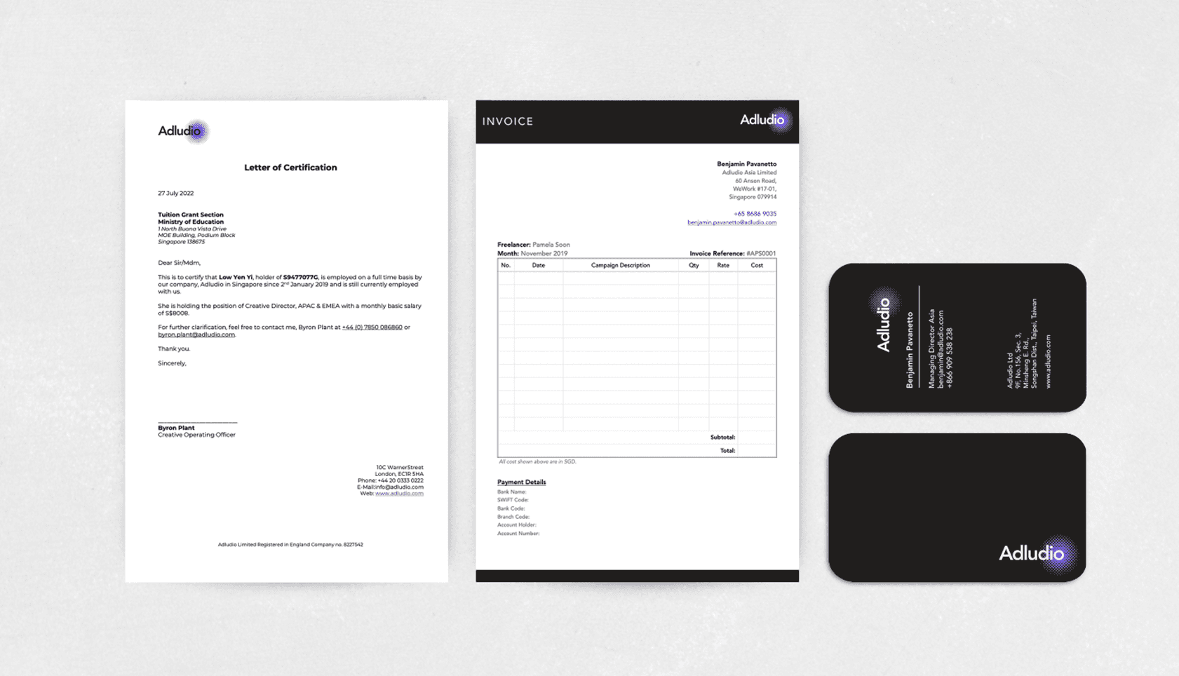
We overhauled both internal and external-facing assets — from sales decks to reseller materials, ensuring everything felt consistent and aligned with the new branding directions.
This wasn’t just a visual update. It changed how teams showed up with more cohesive materials that could help sales and reseller teams present with more confidence.
At the same time, we put a system in place. Templates, guidelines, and repeatable structures meant that new assets could be created quickly without compromising consistency. It reduced friction across teams, sped up turnaround times, and ensured the brand scaled globally alongside the business.
This also shifted the role of creative from a reactive function to a more structured, reliable part of the business, one that could support both day-to-day needs and longer-term growth.
x
Pipeline Growth
Driven through improved brand, campaigns, and sales enablement
%
Asset consistency
Across global teams
with standardized assets
%
Increase in Delivery Speed
Reducing cross-team friction to prioritise revenue-driving work
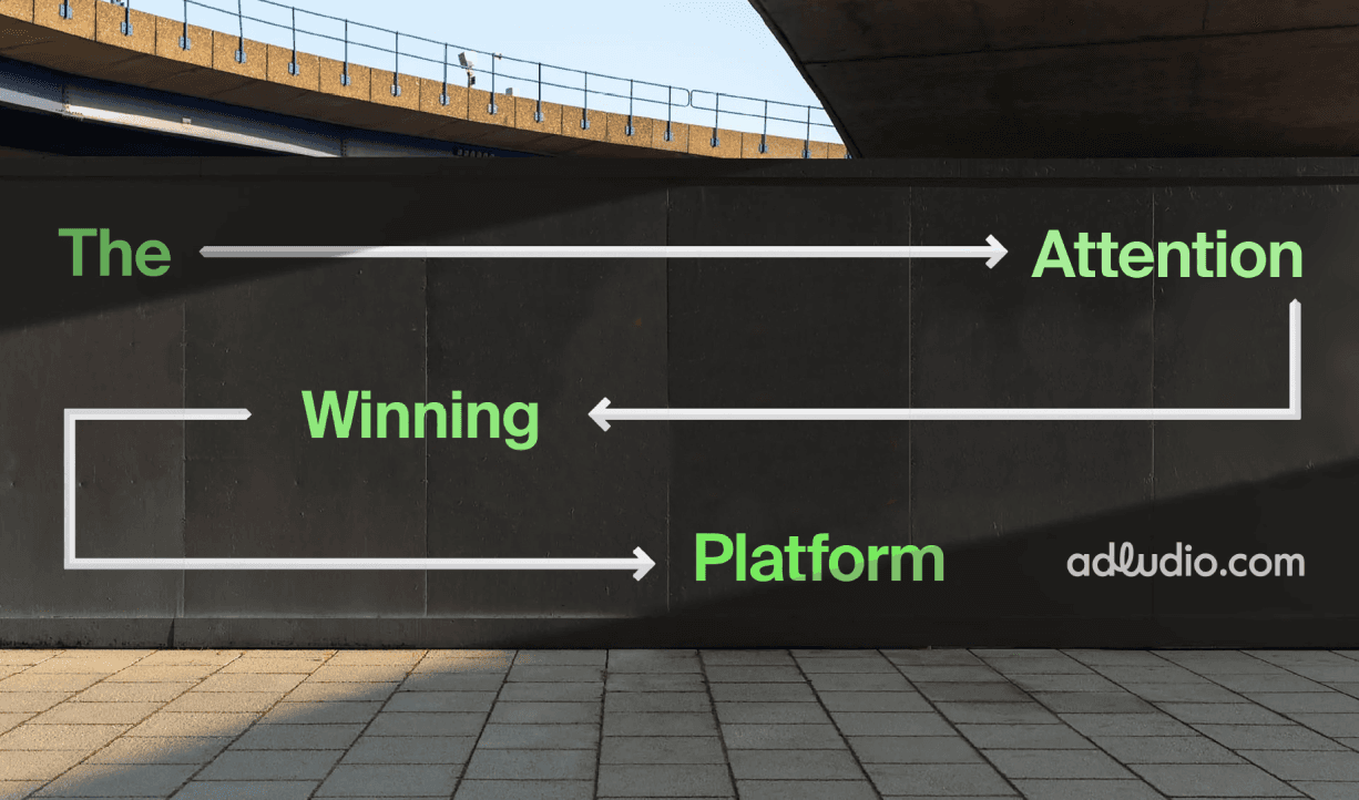
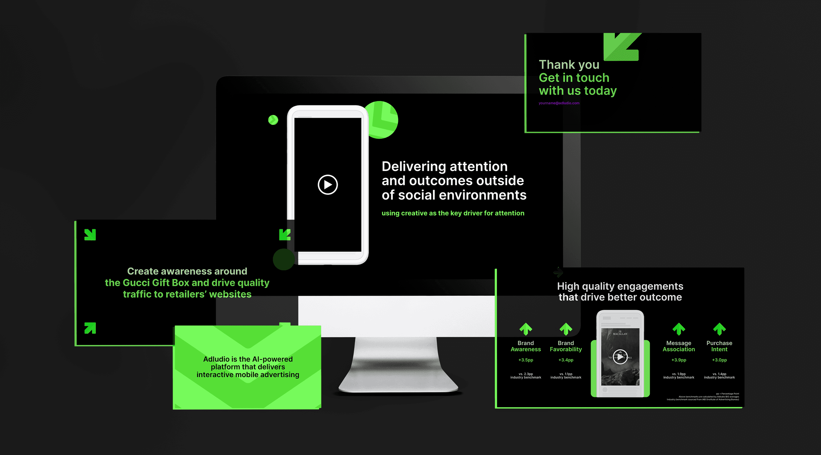
Repositioning the brand to stand out in a performance-driven market.
The space was becoming increasingly crowded, with most players competing on impressions and scale. To stand out, we needed to double down on what made us different — engagement over impressions.
With that direction set by the CEO, I led a full rebrand to better reflect that positioning. The goal was to move beyond a generic ad-tech look and build a brand that communicated our value and to 'stand out' in the crowd.
A full rebrand was rolled out to sharpen our differentiation and reinforce Adludio’s core proposition - creating work that people engage with, not scroll past.


.
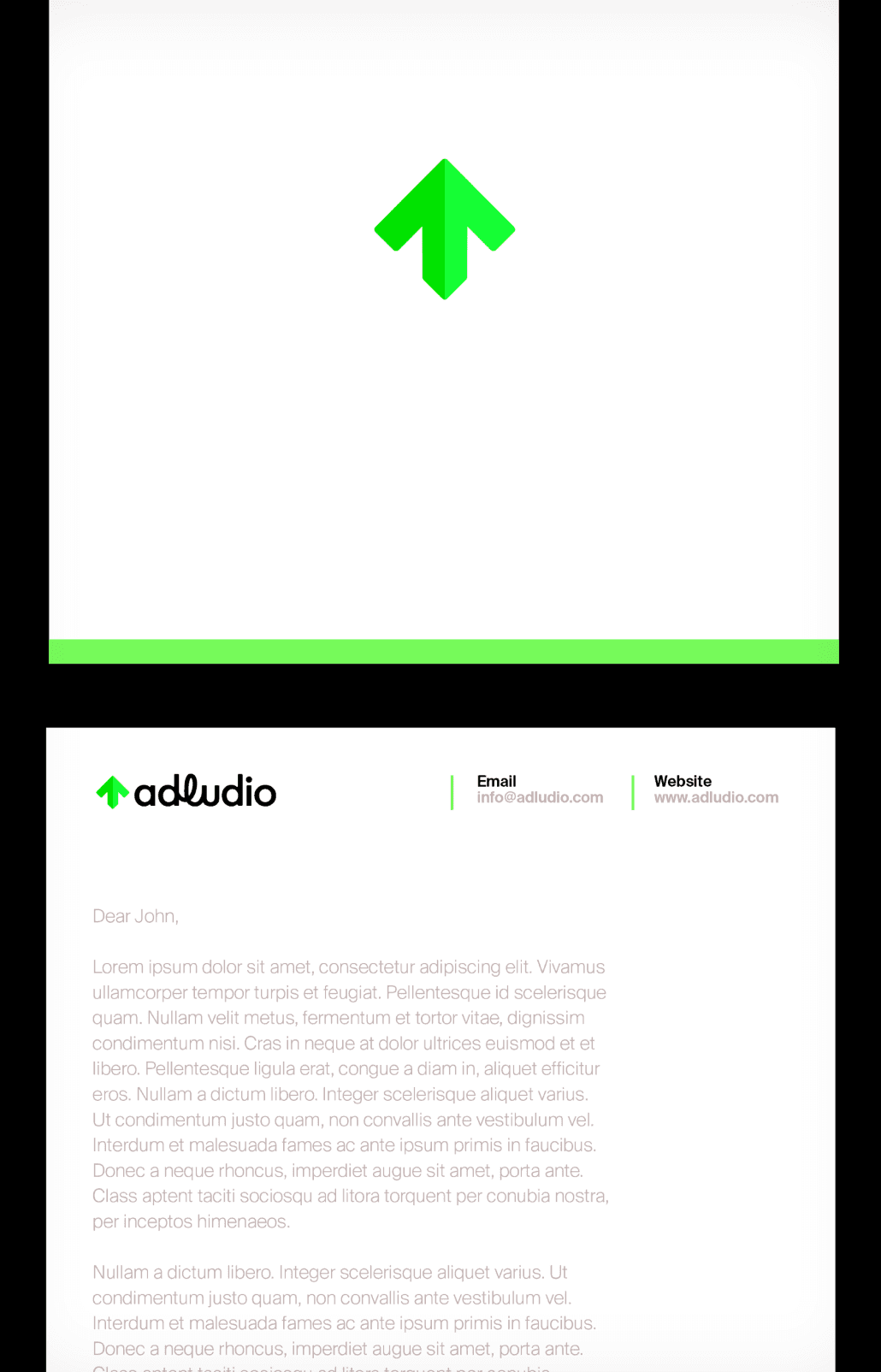
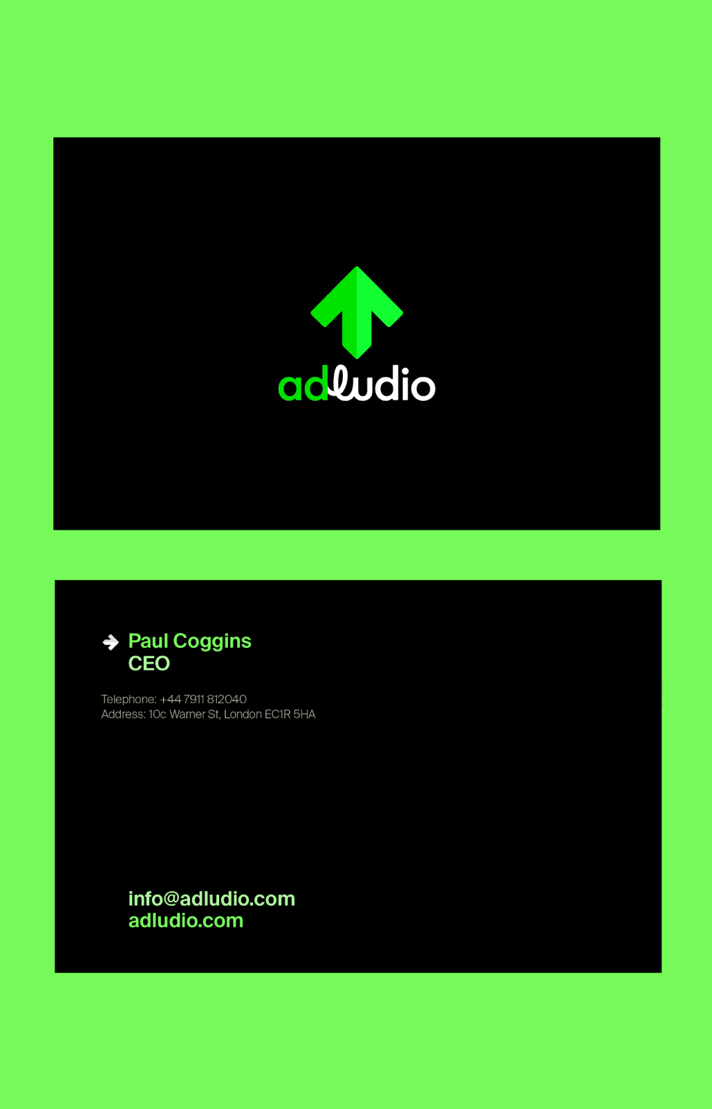
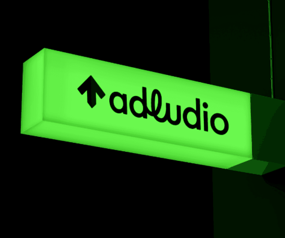
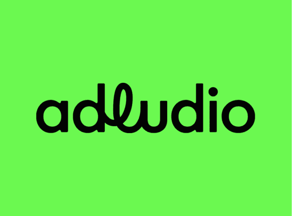
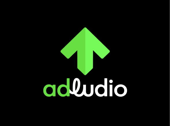
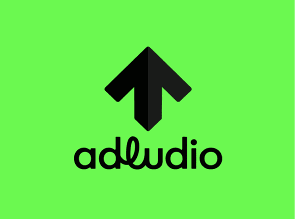
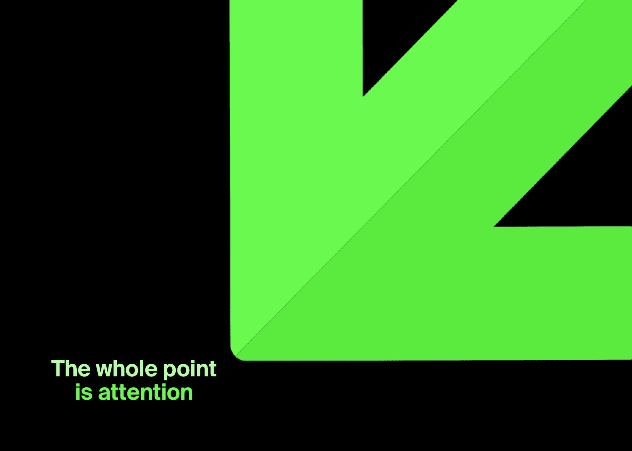
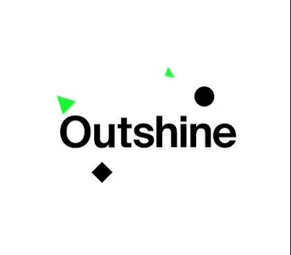
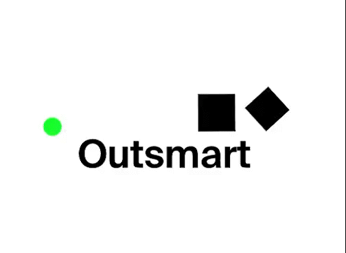
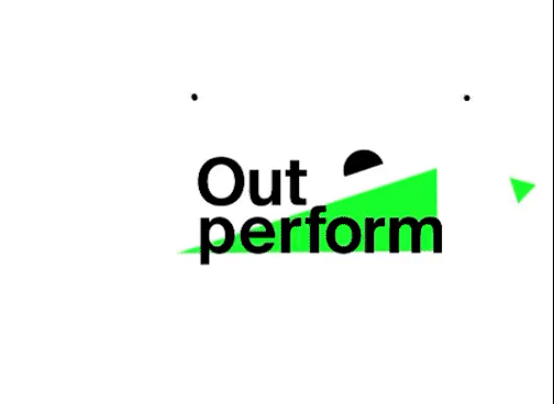
We moved away from the traditional purple and introduced a bold neon green, a deliberate shift to stand out in a crowded, often predictable ad-tech landscape.
It was an effort to strengthen visibility in a space where everything competes for attention, the brand itself needed to interrupt, to stop people mid-scroll in the same way our ads are designed to do.


.
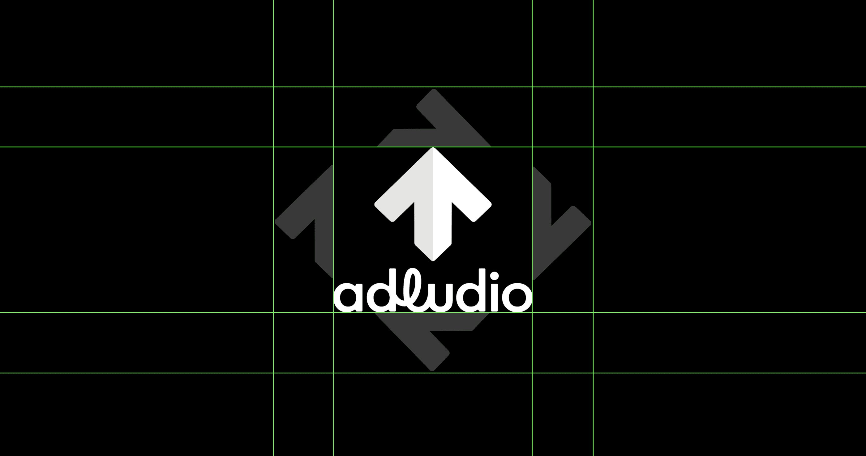
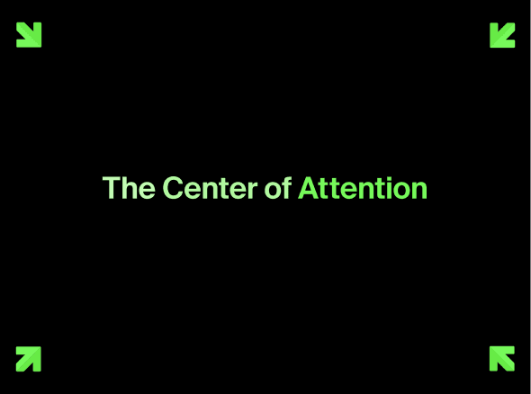
At the same time, we leaned into one of the most consistent patterns across our work: directional cues that drive interaction. Arrows had naturally become a recurring element in our campaigns, guiding users to engage. We elevated that into a core part of the brand system.
That became the foundation of our brand. The arrow informed not just visual elements, but the logo itself, creating a cohesive language that ties back to our core proposition: movement, direction, and action. Every element of the brand was designed to reinforce that idea of engagement, not passivity.


The rebrand successfully repositioned Adludio as a distinctive, engagement-first brand.
The new brand made our core proposition clearer, more consistent, and easier to recognise across every touchpoint.
It gave the team a stronger platform to sell from, helped our work stand out in a crowded space, and aligned the brand more closely with the kind of impact we were delivering.
More importantly, it turned Adludio into something people could quickly understand and remember, not just another ad-tech company, but one built around driving real engagement that mattered to many brands.